Ray Hash
An experimental font project
Working with fonts can be tricky when it comes to laser engraving and pen plotting. Fonts designed for screens are created as vector outlines to define the shapes of characters. If you use a standard font on a plotter, it will draw a stroke around the outline of each character. For instance, to draw the character "I", the pen needs to execute a vertical stroke on each side (as well as shorter strokes at the top and bottom), rather than a single stroke. For the letter O it has to draw bot an outer line and an inner line.

Not only does it take significantly more time, but it also becomes difficult to read at smaller sizes. When you resize your font the pen tip on the plotter, which decides the thickness of the line, maintains its fixed size.
My goal is to automate the process of regenerating any of my artworks.
A smooth process would be:
- Select a collection and a mint number
- Select format to save it (image, animation or vector)
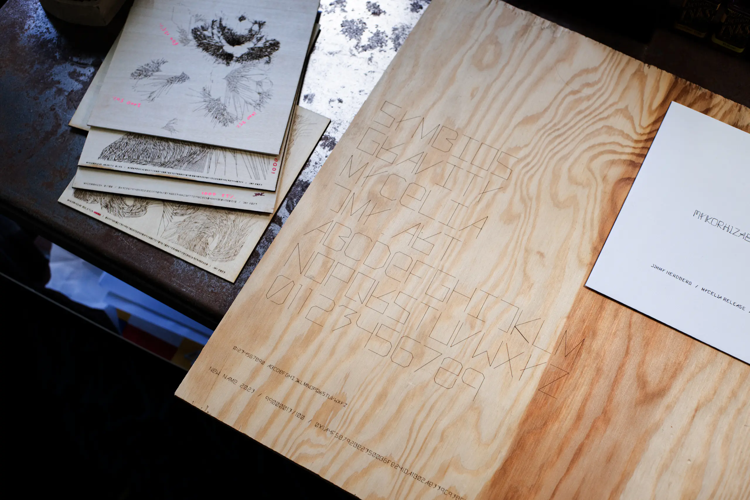
- Add information at the bottom of the image, featuring the collection name, mint number & hash.

To achieve this, a suitable font is required. While there are various line fonts available, I find their appearance unsatisfactory. This dissatisfaction prompted me to embark on this project.
The objectives of this project are as follows:
- Develop a font that can be easily integrated into all my projects as an external library.
- Ensure legibility at small sizes.
- Optimize for speed, preferably draw each character in a single stroke.
- Establish a distinctive and unique visual style.
Balancing Expression and Readability
Making the font readable at small sizes necessitates simplification. However, this simplification may compromise the font's visual expression. To address this concern, I made an early decision to create two variants: one for titles and another for regular text. Let's begin by discussing the title font:

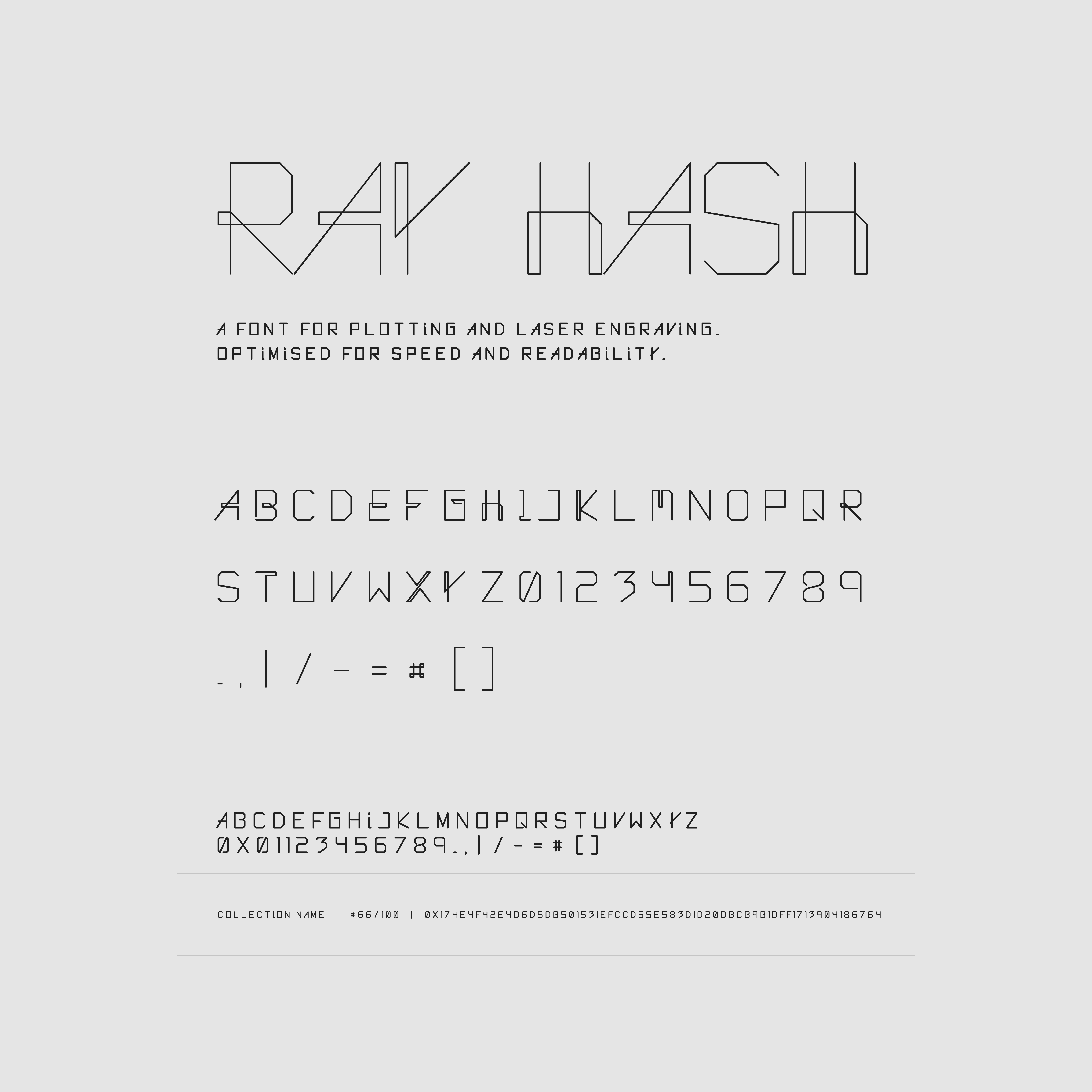
All characters are drawn in a single stroke. This is why some letters may appear slightly quirky, but it is also what gives the font its distinctive characteristics. Additionally, the font is monospaced, except for 'I' and '1'.
The regular font is a simplified iteration of the title font:

For the regular font some of the letters are drawn with several strokes. Clear distinctions are evident between letters that are prone to confusion, such as 'O' and '0', 'I' and '1', and '8' and 'B'. When working with a pen plotter the result is not always perfect and details can easily disappear.
For both versions each letter is constructed by adding points in a 6x9 grid giving them a ratio of 2:3. It is also possible to adjust letter spacing.
I have started to use the font for my projects and is updating letters and functions a long the way. It is built in to my art framework which makes it possible to add extra information to my artworks by adding a json with information about positioning, size etc.
Next steps
What I would like to add is kerning rules for some letter combinations or ligatures. I will also add more symbols and special characters, maybe even a few emojis 😃.
Thank you for taking the time to read!